TimeCluster: Dimension Reduction Applied to Temporal Data For Visual Analytics
This article is about proposing an advanced algorithm for forecasting time series and reducing high dimensionality. The researchers used auto-encoder architecture with convolutional operators to deal with the complexity of sequential data and amazingly they were successful.
About two years ago, I had to cope with time-series data and work on them. It was quite difficult for me at that time, because I hadn’t known anything about how to work on sequential data. Thus, I have started to read a large number of papers and finally, I have gained experience on time series data and done two projects that I applied most conventional algorithms. This encouraged me to write about the most interesting research that I am into them. This article is about one of those researches that I did like to use in my scientific paper but did not. By the way, it is worthy to discuss and it is probable to obtain this architecture in my future project.
The second project that I worked on was quite high dimensional (I think it had about 50 features); thus, I had to read about reducing dimensionality. Yes, you are right; this article is about capturing long dependencies by monitoring their variations over time, finding repetitive patterns, recognizing outliers, and effectively labeling data instances. These tasks are usually done individually; but, in this research, a single model architecture is proposed to do all of them simultaneously. Some other techniques for reducing dimensionality are used for comparison. Because of the power of capturing features, we use deep learning for multivariate time-series data.
Owing to the importance of understanding time-series data, a number of techniques have been developed. In most cases, automated techniques have not accomplished acceptance results, thus researchers rely on visual analytics tools to do their works. What do visual analytics tools do? These tools blend the strengths of machine abilities with human abilities to simplify exploration, analysis, understanding, and providing insights. The goal of this visual process is to tightly couple automatic analysis methods and interactive visualization, to analyze, explore and understand data.
For small time-series datasets, we use time-series graphs, which are usually useful. However, graphs cannot be effective and become challenging for some other tasks such as anomaly detection, classifying time-series subsequences into clusters of similar patterns, etc. We can find some other alternatives for visual encoding like color-fields, horizon graphs, etc.
The summary of this research can be written as below:
- Illustrate a visual analytics system that can be used for identifying patterns, repeated patterns (cluster), outliers (anomalies), and transitions between states in large time-series data.
- Use a deep convolutional auto-encoder (DCAE)
- Provide visual comparisons for various methods
- Evaluating with two different datasets
Overview of the methodology

Data Preprocessing
Normalization
Normalizing is a simple transformation of the scale of the data into a limited domain (usually [0,1] or [-1,+1]). In this research, all values of datasets normalized into the range of [0,1]. The formula is demonstrated below:

Sliding window approach
This approach is prevalent for multivariate time-series data D of dimension d with n time-steps.
D = X₁, X₂, X₃, …, Xₙ
- w: window width
- s: stride
- t: the start time of a sliding window
We’d define a new matrix Zₖ which can be seen as below:

In this research, the values of w and s are equal to 60 and 1 respectively. These values are changeable, and you can set another value to have different resolutions to impact your results.
- The overlapping among windows is good because it can help you to prevent lost data and simplify the smooth transition between time-steps(s) after decreasing the dimension of the features.
The results of the sliding window are considered as points in high-dimensional space. Each point shows the phenomena that are happened at various time intervals.
Dimensionality Reduction (DR)
The reason for reducing dimensionality is to provide another view for us to analyze visually and explore the time-series data. Here, the goal is to reduce the number of features to 2 (two dimensions) by obtaining DR techniques. In a nutshell, selecting which technique to be obtained is crucial because the visualization phase relies on it.
There are several non-linear and linear methods to reduce dimensionality, and three of those popular ones that have been widely used are PCA, t-SNE, and UMAP. (if you are aware of these techniques, feel free to skip 🙂)
PCA (Principal Component Analysis)
Principal Component Analysis(PCA) is one of the most popular linear dimension reduction. Sometimes, it is used alone and sometimes as a starting solution for other dimension reduction methods. PCA is a projection-based method that transforms the data by projecting it onto a set of orthogonal axes. [source]
t-SNE (t-Stochastic Neighbor Embedding)
t-SNE is a new award-winning technique for dimension reduction and data visualization. t-SNE not only captures the local structure of the higher dimension but also preserves the global structures of the data like clusters. It has a stunning ability to produce well-defined segregated clusters. t-SNE is based on stochastic neighbor embedding(SNE). t-SNE was developed to address some of the problems in SNE. [source]
UMAP (Uniform Manifold Approximation and Projection)
Uniform Manifold Approximation and Projection (UMAP) is a dimension reduction technique that can be used for visualization similarly to t-SNE, but also for general non-linear dimension reduction. [source]
In this research, these three and the proposed deep convolutional auto-encoder (will be discussed in the next section) are used for dimensionality reduction. The aim is to differentiate and visualize high-dimensional data by having a location in a two-dimension space for each point. Also, the high-dimensional data has its own complexity therefore to deal with that researchers used DCAE and then used DR techniques to reach 2D visualization; whereas, univariate time-series are less complicated and straightway reduced to a 2D using those three earlier mentioned DR techniques.

Deep Convolutional Auto-Encoder (DCAE)
We can use the Auto-Encoder structure for reducing dimensionality. Also, in recent years, Convolutional operators have shown great potential for various complex tasks. Consequently, when it comes to being deep; I mean deep convolutional auto-encoder, we have a potent model architecture that is able to reduce nonlinear dimensionality.
In regard to being supervised or unsupervised learning, DCAE is an unsupervised algorithm that consists of an encoder and decoder parts, the encoder encodes the data to project the data into a set of feature spaces and the decoder decodes the output of the encoder to rebuild the output data. The locality feature of convolutions puts DCAE in a better position with less time consumption in comparison with usual auto-encoders in rebuilding.
I will demonstrate all concepts that I think will be useful; so, if you are aware of these you can skip these sections.😉
Auto-Encoder
In brief, auto-encoders are unsupervised learning architecture that at the first half of its structure compress and encodes the data and then reconstruct the data in the latter part. In other words, by encoding the data, the model reduces the dimensions of the data by denying the noise of the data.

For a thorough understanding of auto-encoders, I highly recommend reading this Stanford tutorial. Also, you can read this blog that is complete to me. Also, this is a good introduction to implementing auto-encoders in TensorFlow.
Convolutional Neural Networks
First-time CNNs used was around the 1980s to recognize handwritten digits. CNNs are a class of networks and mostly applied on images, but have shown great potential on time-series datasets. The role of CNNs in image processing is to transform images to a form that makes the process simpler. Well, here images are not the case.
CNNs can be used to obtain feature maps by filtering the input in which each convolutional layer includes kernels and bias. The process of convolution can be described as below:

DCAE Architecture

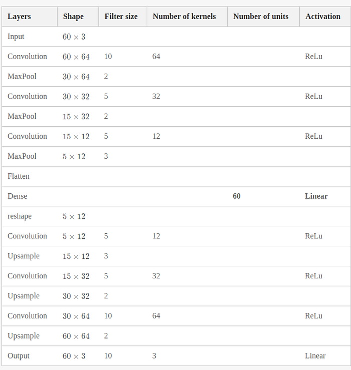
As it can be seen, the activation function for all layers is ReLu (ReLu(x) = max(0,x))except the last layer for output. The model includes three main parts (encoder, decoder, and bottleneck (compressed representation)).
In the encoder, we have three convolutional layers and each follows by a pooling layer. The max-pooling is used which is a down-sampling operation on feature maps. and likewise the decoder part. First decreasing the size of layers to reach the bottleneck and then, increasing. The model works by repeating each temporal step n times along the time axis.
The Python code for the model in TensorFlow can be coded as below:
The run summary (statistically) can be summarized as below:

The chosen optimizer is Adam optimizer and the batch_size is 100 random shuffled windows. The researchers trained DCAE for the feature extraction process. Then, they projected the features in the latent space (bottleneck) to 2D space by use of DR techniques. This can be seen from figure 4.:

Visualization and Interaction Techniques
It is not absurd if I say one of the most important parts of developing machine learning algorithms is to visualize it. Whenever you develop or propose a model for a certain aim in any industry, you need to show that your model is working and provides good results; Not just provide some metrics/numbers such as MSE (Mean-Squared-Error) or etc. So, let’s see how it is in this case:

Figure 5 is in fact widespread mantra ‘overview first, zoom and filter, and then details-on-demand’ by Professor Ben Shneiderman in his paper. So, let’s dive into each section of this overview.

This is just a display of the original data provided on the time axis.

Figure 5B is used to make navigation techniques simpler on time series data. This figure shows the transformed data points after reducing dimension by any of the mentioned methods.
In this section, before we label data points one by one, they are clustered and have the same colors and concentrated in certain areas. Each data point links to the previous point (inner) and the next point (outer) as a mark for the flow of time.

Section C is showing the connected scatter data points which seems simple at first look but it has very specific functions in this approach that can see in section D. Here, we can select and zoom to facilitate fast and interactive exploration in large datasets.

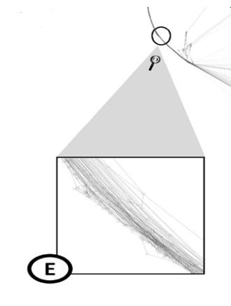
In addition to what we saw in section B that each cluster is colored by some colors, there are some data that can be displayed as in Figure 5E. These data are not included in clusters but are helpful in tracking the transition between data points and clusters.
There are two case study that discussed in this research, but I think demonstrating them make this article long. So, I invite you to see this youtube video by Prof. Mark W. Jones.
Reference
1. Ali, M., et al., TimeCluster: dimension reduction applied to temporal data for visual analytics. The Visual Computer, 2019. 35(6): p. 1013–1026.
Please note that this post is for my research in the future to look back and review the materials on this topic.
If you found any errors, please let me know. Meanwhile, you can contact me in Twitter here or LinkedIn here. Finally, if you have found this article interesting and useful, you can follow me on medium to reach more articles from me
